Slideshow Component
React, TypeScript


This is the portfolio site you're currently viewing. It also serves as a personal UI experiment playground. Everything here is hand-coded from scratch in React and TypeScript—down to a home-baked sprite sheet animator with CSS, canvas, and WebGL rendering options available by the swap of a parameter. React and GSAP are the only dependencies in the client bundle.
The project was built to sharpen my React skills and showcase the polish I bring to UI development.
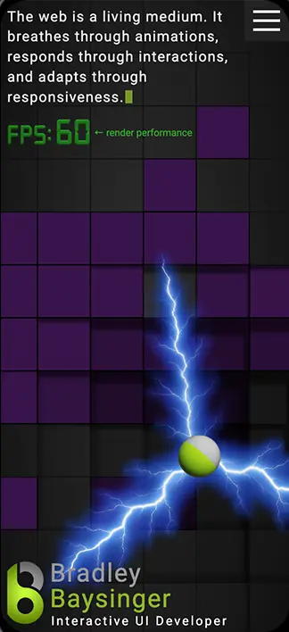
A notable core feature is the carousel here on this page. It's absolutely unique to the internet, in that it leverages browser-native touch/gesture input with layered carousel elements for rigid parallax synchronization. Try swiping or dragging the devices, then use your browser's back/forward buttons to see how tightly it (optionally) integrates with routing. Why isn't every carousel this elegant? It's capable of more than you're seeing here... Parallax platformer games via browser-native gestures? It will do that. And I can't wait to explore the possibilities.
And you've probably noticed the home page header, where giant 8-bit pixels respond to pointer movement with magnetic repulsion via simulated depth. That's not a 3-D library. This system will become more optimized and featured as time allows, but I'm already exploring more advance rendering techniques for it.
A Payload + Next.js backend is in development here. But, the list of innovations across this site—and in my recent work—is already too long to fully cover here. Several features should be expanded into standalone open-source libraries, as time allows. The takeaway is that I compulsively invent new efficiencies and better processes, with reusability being cornerstone, as I loath redundancy.
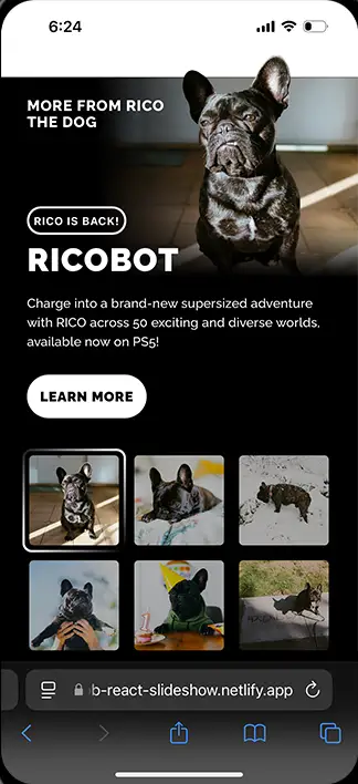
This is a reusable React slideshow component built to be deployed (optionally) as self-contained single-page app (SPA), developed as part of a deep dive into React hooks and state management.
Designed with scalability, performance, and accessibility in mind, it features auto-slide functionality, deep linking via dynamic routing, and intuitive user interactions, including pausing, resuming, and manual navigation.
The component is highly configurable — developers can pass in slides as an array of objects containing foreground and background images, thumbnails, and JSX content. It dynamically adjusts its height based on slide content to eliminate excess whitespace, ensuring an elegant layout across devices. Additionally, lazy-loaded images and optimized animations enhance performance for a smooth user experience.
Custom navigation controls are fully supported, with two built-in options available. Developers can also define their own controls and even integrate multiple sets.
More details are available in the code repo. This project is still evolving, with additional features and documentation in progress. It also serves as an example of code quality, so if JavaScript is your thing, take a look at the solutions it implements.
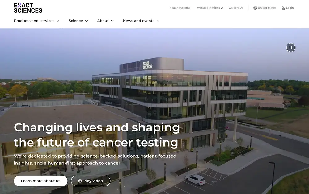
Exact Sciences is a leading molecular diagnostics company specializing in early cancer detection and treatment guidance.
At Epsilon, I contributed to the development of the Exact Sciences website within Sitecore, implementing interactive elements, refining styling, resolving defects, and building modular, reusable components to ensure scalability and consistency across the site.
One of my key contributions was an interactive oncology report explorer, designed to help patients and practitioners better understand their diagnostics.
I contributed to the Golden1 Credit Union website by developing interactive features such as accordions, navigation, and a card comparison tool—though the latter has become somewhat redundant now that the number of available cards has been reduced to three.
In addition to feature development, I was responsible for optimizing performance, accessibility, and SEO. Using Lighthouse diagnostics, I meticulously audited both the front-end and source code to identify and reduce unused and bloated code, and identify and resolve inefficiencies.
That said, I've noticed a few defects that have crept in since my time on the project—definitely not claiming those, lol.
HTML email development is everyone's favorite, right? Lol, well I embrace any challenge and try to breathe innovation into and improve processes on every project if there's room for it. And there usually is.
At the start, I was surprised that the Salesforce platform didn't have better features. No room for best practices, documentation, version control, or preprocessing. Brand new to email, I took the initiative to develop a system to bring all of that and standardization to the team's workflow.
I also served as a mentor for the new email developers, and moved on as developing preference centers and concent workflows in OneTrust became my primary duty at Epsilon.
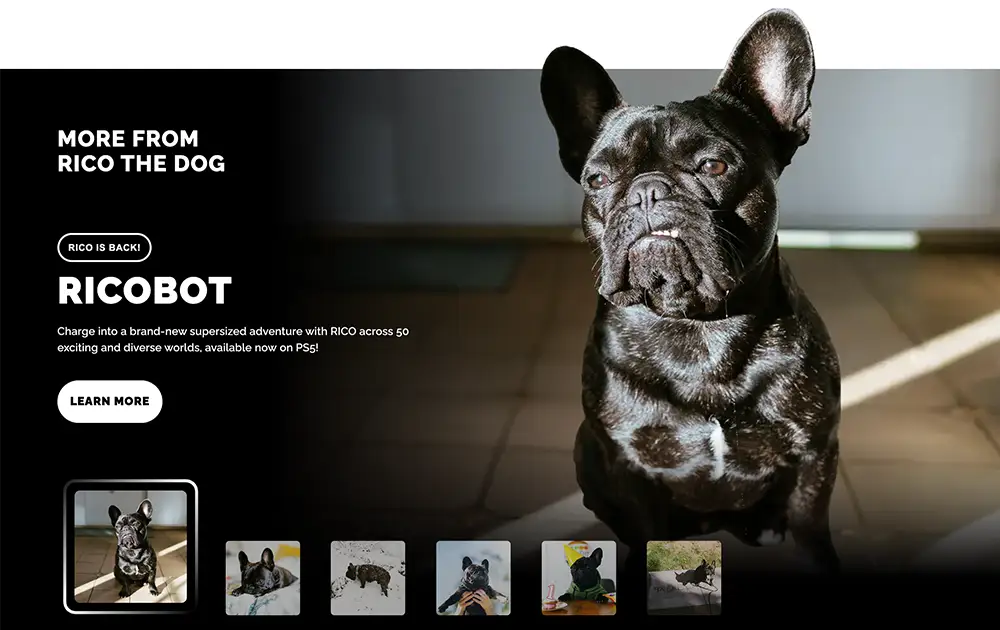
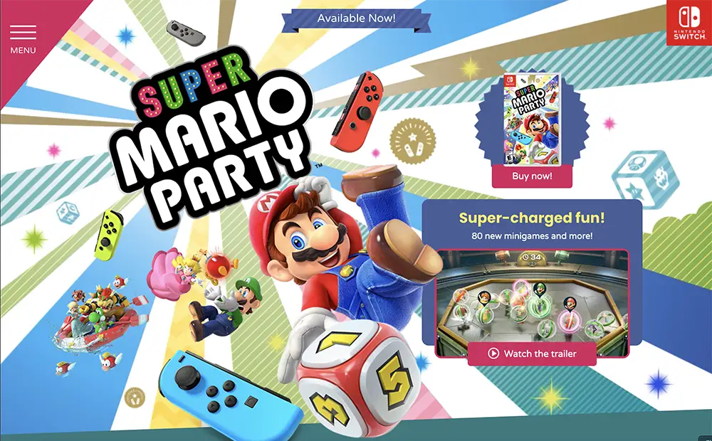
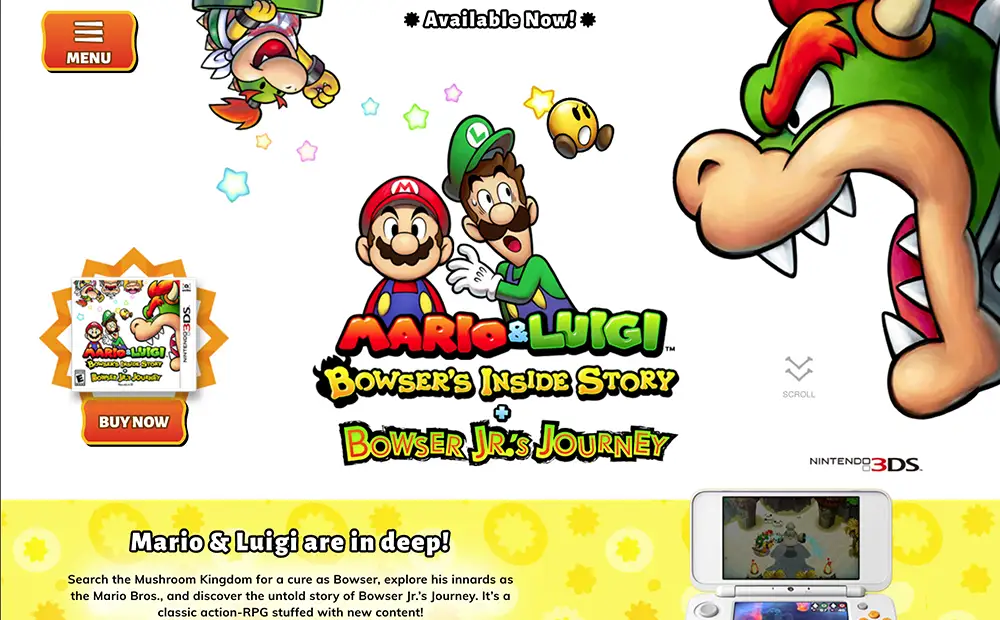
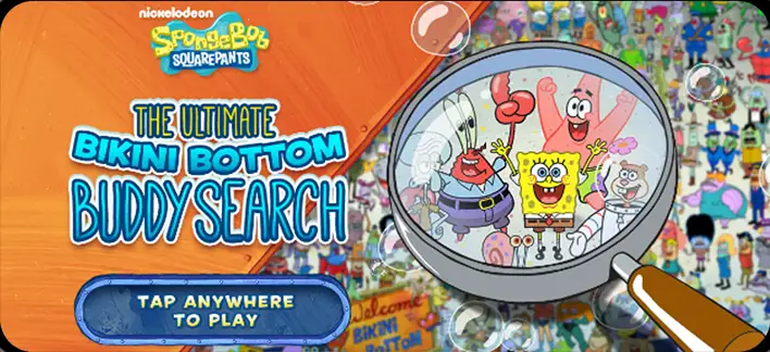
I've always been a fan of Mario Bros. games (though my favorites were on the Atari 7800). The mini-games in this one are seriously addictive.
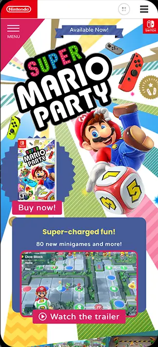
I developed the interactive activity where users search for hidden Toadettes behind various elements on each page. This feature was integrated with Nintendo's microsite API and included multiple overlapping states and flows (disabled for the portfolio) based on user region and status.
I also implemented the 'event space' button—the large green button on each page that delivers a fun little surprise.
Additionally, I was responsible for the video player and various responsive elements throughout the site.
These projects typically operate under tight deadlines, with only 2-3 weeks for development and limited budgets, which influenced the development approach.
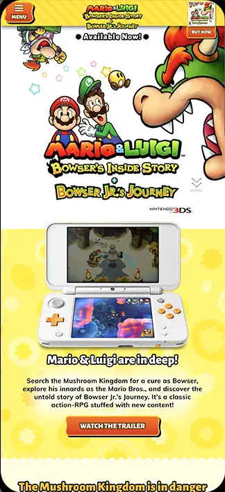
This Mario Bros. Nintendo DS game site featured a detailed hero animation, which required some intricate CSS3 work. I designed the responsive elements to adapt fluidly without relying on breakpoints, allowing the entire sequence to be scripted only once.
The bounce effects on certain page elements and the rubbery button interactions involved creating a custom system for dynamically animating SVG paths.
Beyond animations, I also contributed to the site's responsive layout and localization.
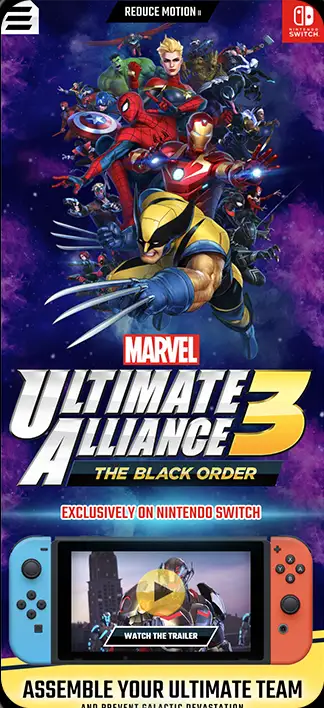
For the latest entry in Marvel's Ultimate Alliance series, I developed the central interactive feature: a wallpaper creator that lets users select characters from the game to generate a personalized image for their phone, computer, or Facebook cover.
Additionally, I worked on canvas animations throughout the site, implemented the main video player, and contributed to the responsive page layout.
Accessibility became a new requirement for Nintendo on this project, which led to the implementation of a 'reduce motion' feature. This setting pauses all animations—whether JavaScript, CSS3, canvas, or video—ensuring a more accessible experience for users with motion sensitivity.
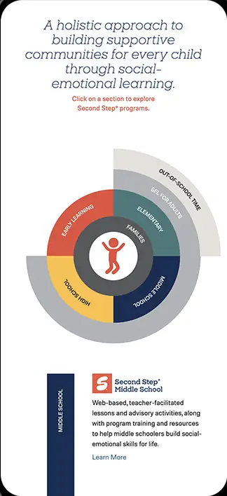
Committee for Children is an educational charity that reaches over 16.5 million children annually across 70+ countries.
We developed an interactive component to showcase their Second Step program, featuring a multi-layered wheel navigation dynamically rendered using SVG, React, and React Motion.
I took the lead on technical advising, development, and contributed to the project's conceptualization.
Working with SVG in React proved to be incredibly powerful to me, opening up new possibilities for vector-based rendering and interactivity.
An informational landing page designed to help Premera customers understand their benefits and find the right treatment options.
The page integrates with email marketing campaigns, using query string variables to deep link users to state-specific information.
The original design included a blur effect on the page background when the modal carousel was active. Implementing this across different browsers required some creative problem-solving to ensure consistent support.
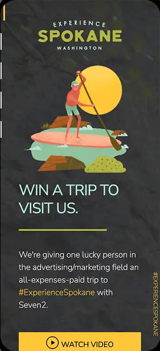
A promotional site for Seven2, where I had full creative freedom in development. I chose Angular, as it was the framework I was most comfortable with at the time. The project was halted before completion, so some features remain unfinished.
But there are some interesting animations that were created in Adobe Animate and exported for HTML5 canvas. I have extensive experience in animations created this way, and have authored some timeline tools that enable Flash-like interactivity.
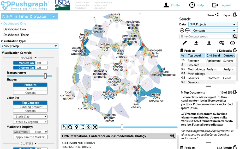
Pushgraph is an advanced data analysis tool developed by ChalkLabs, leveraging semantics to identify patterns, redundancies, and similarities in research data. It was widely used by government agencies, helping to save the federal government billions of dollars annually.
I designed the UI for the 2017 iteration, which was a significant overhaul of previous versions. This version was entirely built around an Angular-based drag-and-drop widget dashboard that I designed and developed.
As no screenshots are available, the image shown is a rough design used as the foundation for development. Due to the highly secure nature of Pushgraph and other ChalkLabs software, there are no live demos. Please review the project reel for a better sense of the final implementation.
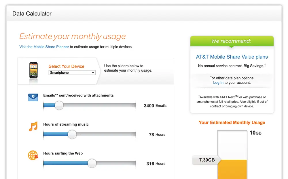
A JavaScript web app designed for AT&T Wireless customers to estimate their data usage and choose the most suitable plan. This was one of several data usage calculators we developed for AT&T.
This version predates AT&T's transition to responsive design, so the page was built as a fixed-width layout.
Over the years, I worked on countless AT&T projects, many of which have since become legacy tech as the company evolved its platforms and offerings.
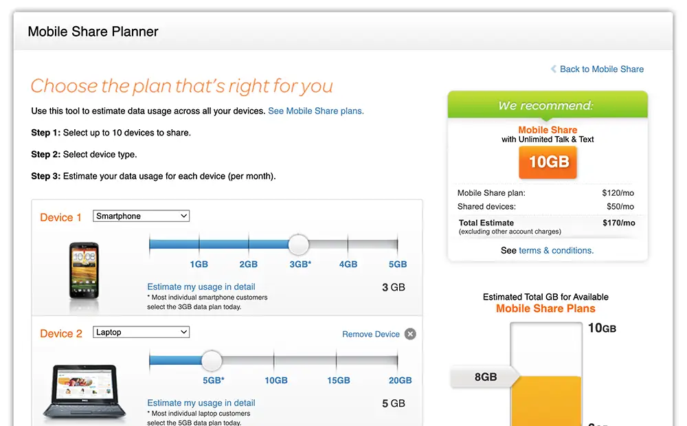
A JavaScript web app designed for AT&T Wireless customers to estimate data usage across multiple devices and select the most suitable plans. Clicking the 'Estimate my monthly usage in detail' links reveals an additional layer of complexity within the tool. This was one of several data usage calculators we developed for AT&T.
This version predates AT&T's transition to responsive design, so the page was built as a fixed-width layout.
Throughout my time working with AT&T, I contributed to numerous projects, many of which have since become legacy as the company modernized its platforms and technology.
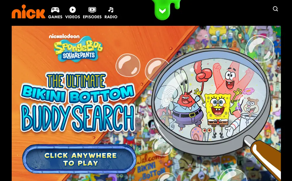
A Where's-Waldo-type game with different clues and play style on each level. This would take some time to play through to the good stuff, so I activated a cheat so you can play any one of the five levels.
Though you might expect each level to progress in difficulty, instead these tend to progress in reward of each preceding play style, with the final level being the most fun. Drive the submarine around, and use radar to locate the characters.
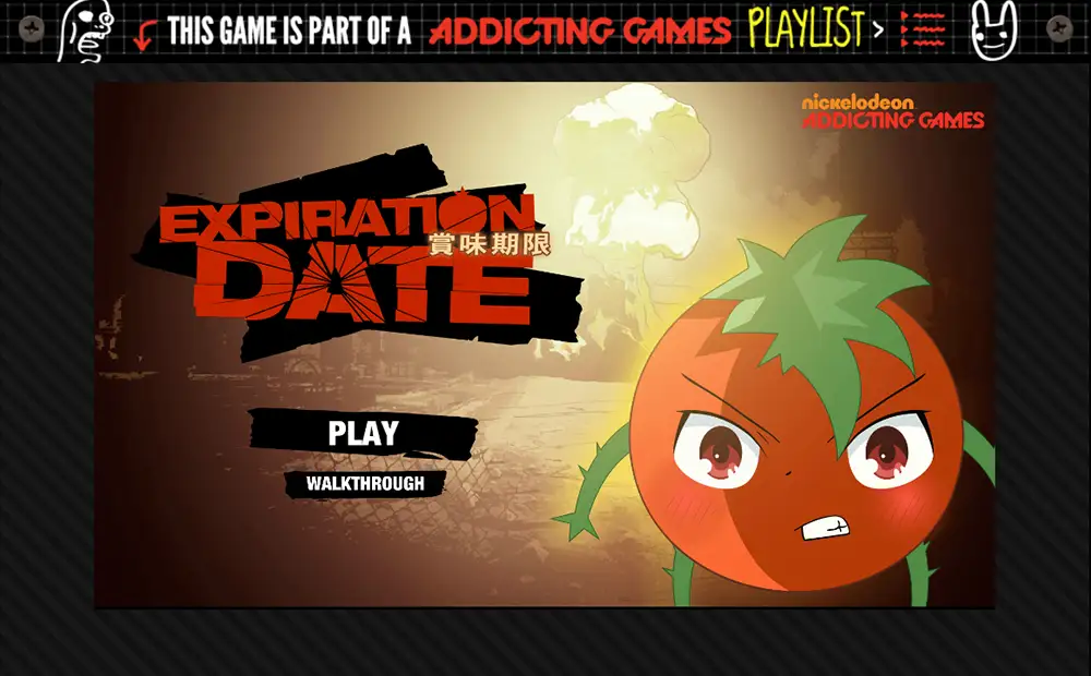
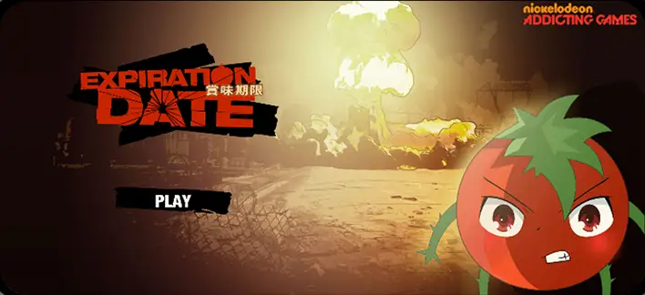
A post-apocalyptic escape game. We've all been nuked, but you lived and your DNA has combined with that of a tomato. If you think that's freaky, just wait until you see the rest of the house! Watch out for Mom, she's quite upset with you.
I produced the framework for the game and a logic system for all of the interactive elements to work with each other. At a glance, I could see that implementing 'if' statements dispersed around the site could be messy and hard to debug, so I devised a system that employs a single XML document to contain game state, define interactive elements, and how they behave with respect to each other. The state of the entire game can observed by outputting a single sheet of XML, which is a native datatype in ActionScript 3.0.
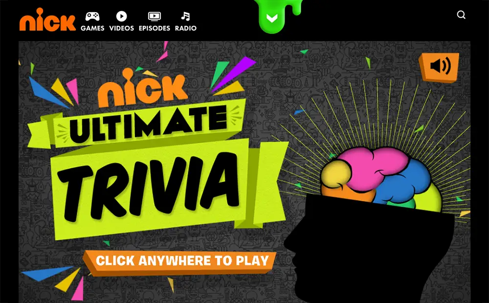
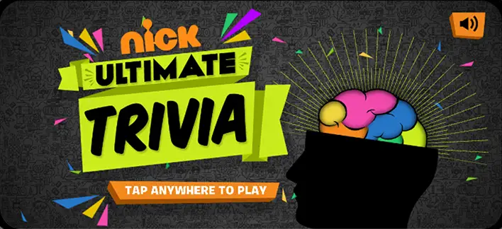
A Nickelodeon trivia game featuring over two thousand possible questions, including multimedia-based challenges.
I developed the entire game, aside from contributions by animators.
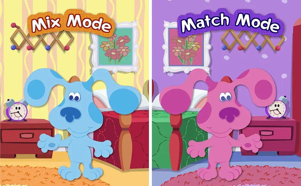
Two dress-up games in one! This was Seven2's first game for the Nickelodeon Group. The match mode is a real challenge—you could say I've mastered it over the years.
As well as building out most of both games, I created a reusable drag-and-drop system for this project, which I later ported to ActionScript 3.0 and eventually Haxe/Flambe. Fun fact: that old alarm clock still keeps perfect time after all these years.
It's not possible to pick a single project to represent the wide range of interactive pieces I created during the Flash era—but this one stands out as a notable mention.
This project won the Golden Pixel Addy Award in 2008.
The linked emulation is far from perfect, but it at least runs... and brings back a lot of memories.